Topological Distances
We now understand the fundamentals of TDA, and persistence diagrams. But how do we compare the results of two filtrations? This will be covered in the following tutorials.
Overview
To begin our first Saturday session, we will review what we learned yesterday about TDA. We will discuss methods to compare differing topological filtrations. In doing so, we give a quantifiable, stable way to discuss differences in shape.
This session is co-presented by Brittany and Ben.
Objectives
After this session, we hope that you will be able to:
- Feel confident using simple filtrations in topological data analysis
- Understand the idea of stability in a metric
- Understand the bottleneck distance between persistence diagrams
- Feel confident using the bottleneck distance in R
Getting Started
To start day 2, we’ll begin with a warm-up exercise to refresh on the topics we covered on day 1.
Let’s create a simple example, similar to the one we saw at the end of session 3, and conduct a height filtration.

We’ll start out by doing something similar, but on a new complex.
Let’s create a new R script for this session, and call it TDA-Distance. Begin by creating an example simplicial complex in R.
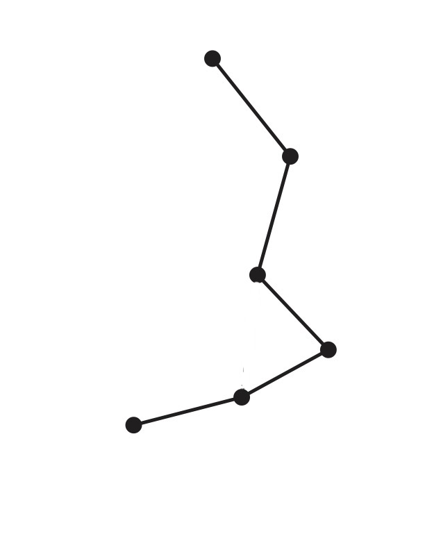
cplx <- list(1,2,3,4,5,6,c(1,2),c(2,3),c(3,4),c(4,5),c(5,6))
As a warm up exercise, try drawing the simplicial complex that results from the above code. (You hopefully should’ve received paper)
See the Answer
And then assign function values on the vertices.
cplxf1 <- c(0,1,2,3,9,0)
cplxf2 <- c(1,12,2,0,1,0)
Now that we have a a function on a complex, do you remember how to compute a directional filtration on this data? Try doing that now for each function on the vertices, cplxf1 and cplxf2.
Try this first by hand. Then, write the corresponding code for the filtration in R using the funFiltration and filtrationDiag functions, which computes the filtration and its diagram, respectively.
See the Answer Code
# for f1
filt1 <- funFiltration(cplxf1,cplx)
diag1 <- filtrationDiag(filt1,maxdimension=2)

# for f2
filt2 <- funFiltration(cplxf2,cplx)
diag2 <- filtrationDiag(filt2,maxdimension=2)
See the Resulting Diagrams
> diag1$diagram
     dimension Birth Death
[1,]         0     0   Inf
[2,]         0     0     9
> filt2 <- funFiltration(cplxf2, cplx)
> diag2 <- filtrationDiag(filt2,maxdimension=2)
> diag2$diagram
     dimension Birth Death
[1,]         0     0   Inf
[2,]         0     1    12
[3,]         0     0     1
Verify that this output matches yours! For a nicer visualization, be sure to plot the diagrams.
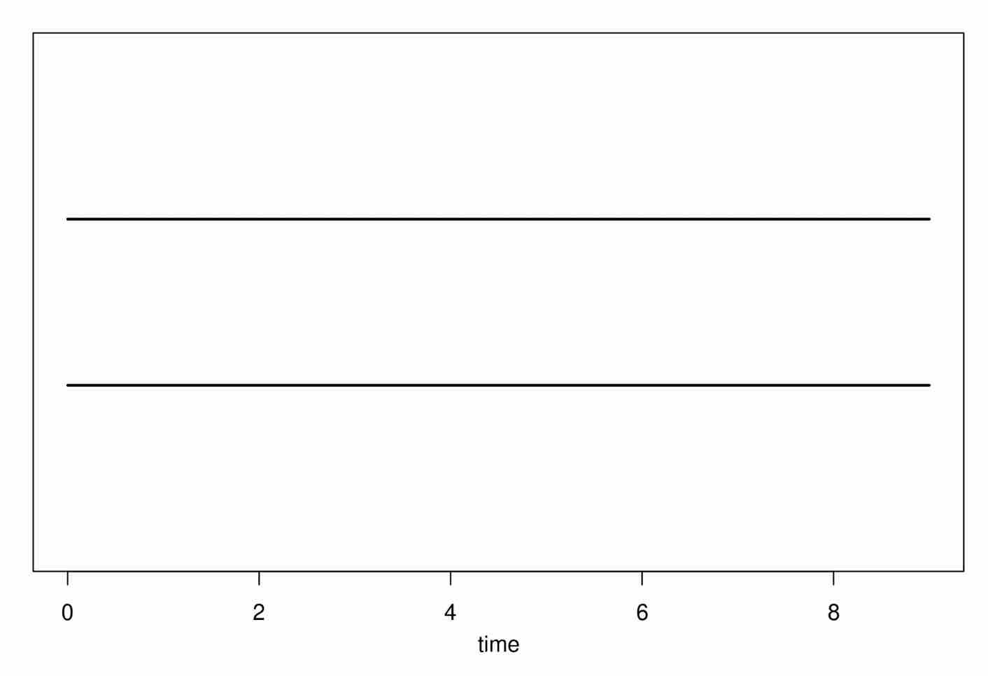
# plot the persistence diagrams from each filtration
plot(diag1[["diagram"]])
plot(diag2[["diagram"]])

#plot the barcodes from each filtration
plot(diag1[["diagram"]], barcode=TRUE)
plot(diag2[["diagram"]], barcode=TRUE)
Plot the Resulting Diagrams
Plot the Resulting Barcodes
Distances in Topological Data Analysis
Now that we have our hands on two filtrations with different persistence diagrams, a natural question emerges. How do I measure distance between them? Indeed, each filtration is clearly doing something different!
The main new concept we’ll introduce in this session will be defining distance in TDA. This is done by defining distance between persistence diagrams.
Let’s briefly think about what a persistence diagram is. Really, it’s nothing more than a set of points, and a diagonal.
Distance Between Sets of Points
First, we will think about distance between two sets of points in $\mathbb{R}^2$. Consider the finite sets $A,B \subset \mathbb{R}^2$. If we wanted to define distance between $A$ and $B$, we could think about the weight of the optimal pairing between points in $A$ and points in $B$.
That is, for $\Gamma$, the set of all bijections $f: A \to B$, we have $d(A,B) = \min_{f \in \Gamma} \max_{a \in A}||a-f(a)||_2$.
Here, we work with the standard Euclidean distance to ease into things.
Let’s visualize this with an example, where $A$ is in red and $B$ is in blue:
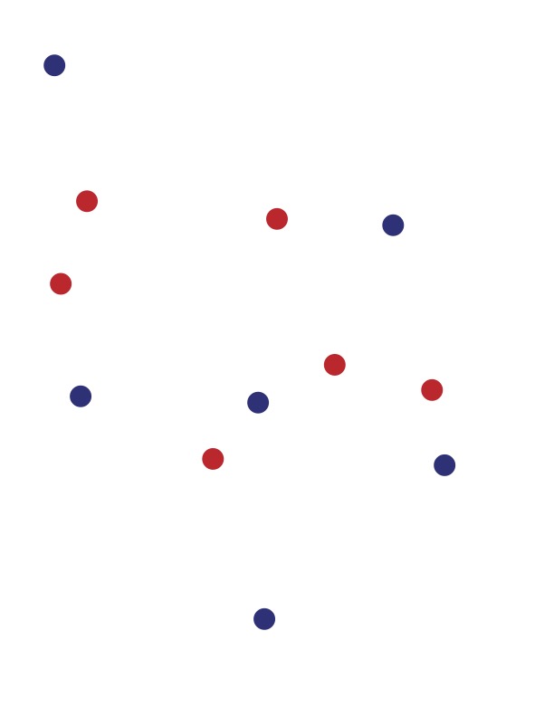
With this example, can you visualize what we might do to find the optimal pairing between $A$ and $B$?
See the Answer
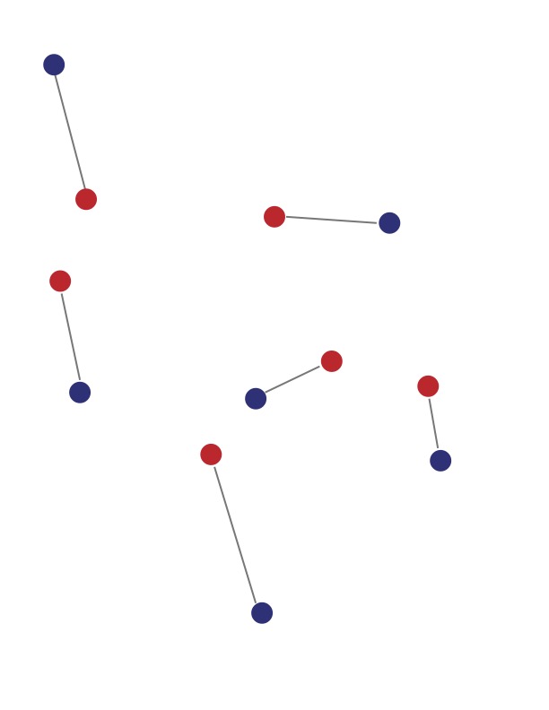
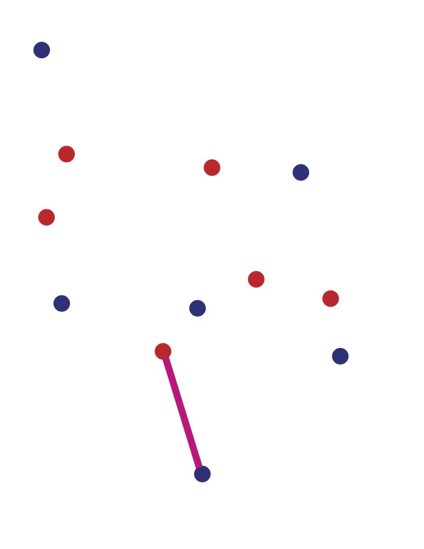
Finally, the weight of such a pairing is the largest distance between pairs. See if you can pick this out in our example.
See the Answer
Incorporating Persistence Diagrams
We can use the same idea for persistence diagrams. That is, given two persistence diagrams $PD_1$ and $PD_2$, we compute the optimal matching between points, and find its weight.
If we think of the points in the diagram as simply points in $\mathbb{R}^2$, then we can find a matching just as before:
However, there should be one glaring issue that comes to mind in doing this.
What if PD1 and PD2 have a different number of points?
And, perhaps a more subtle issue:
What if the matched points are far away, but have low persistence?
Indeed, then a bijection would not be possible or reasonable, and our distance is not well-defined.
To handle this issue, we consider partial matchings and charge separately for unmatched points. Let $\Gamma$ be the set of all partial matchings from $PD_1$ to $PD_2$. Then, the bottleneck distance between persistence diagrams is
\[d_B(PD_1, PD_2) = \inf_{f \in \Gamma} \left( \max \left( \sup_{(p,q) \in \Gamma}||p - q||_{\infty} , \sup_{x \notin f} \frac{1}{2} ||x||_{1} \right) \right)\]A Quick Refresher on Infinity Norms
If you haven't seen the infinity norm or need a refresher, it is defined by taking
the maximum element in a vector: $||X||_{\infty} = \max_{x \in X}$.
So, in a way, we can think of the unmatched points as being charged the distance to the diagonal (the line $x=y$).
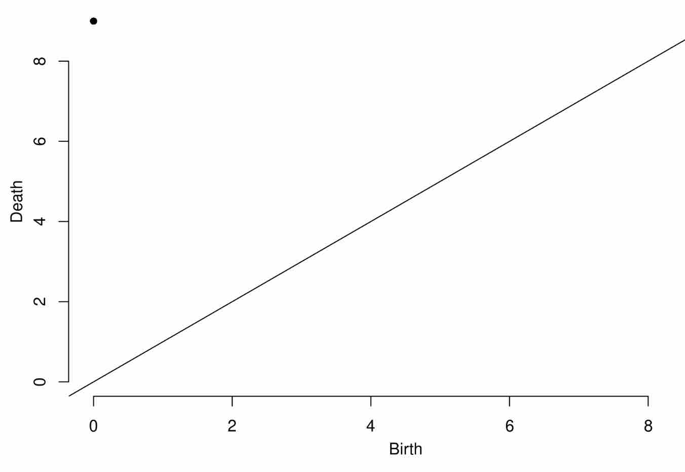
Let’s take a look at our example from before. With these two height filtrations in hand, we can define the bottleneck distance between them in R.
Recall each persistence diagram, and think for a moment about the optimal pairing defining the bottleneck distance.
diag1$diagram
plot(diag1[["diagram"]])
Expected Output
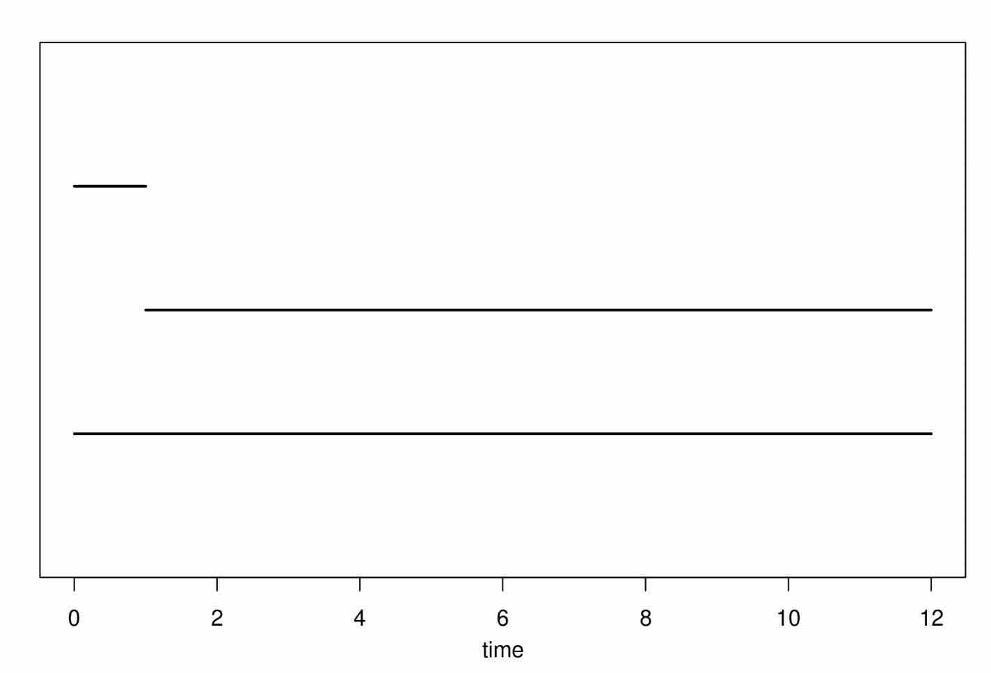
> diag1$diagram
     dimension Birth Death
[1,]         0     0   Inf
[2,]         0     0     1
Expected Output
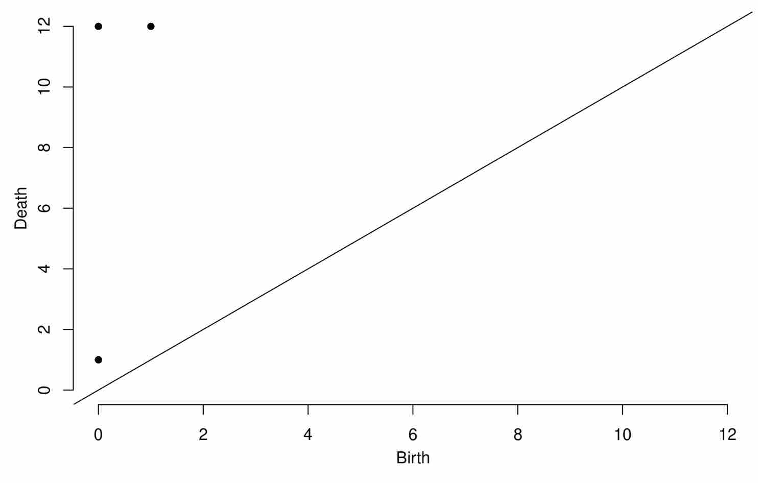
diag2$diagram
plot(diag2[["diagram"]])
Expected Output
> diag2$diagram
     dimension Birth Death
[1,]         0     1   Inf
[2,]         0     1     3
[3,]         0     2     4
Expected Output
Clearly, the findings differ between diag1 and diag2. See if you can figure out what the optimal matching would be in this example.
See the Answer
The optimal matching in this example will pair the two points dying at time infinity, the birth-death pair in diagram 1 (0,1) with
the diagonal, and (1,12) with (0,9).
Knowing the optimal matching, what should the bottleneck distance be in this example?
See the Answer
3 (Taking the pair (1,12) and (0,9) and applying the infinity norm.)
The Bottleneck Distance on a Grid Filtration
From yesterday, remember that we can conduct a directional filtration on a grid, starting from an image. Let’s create another example image, and do a grid filtration.
n=20
vals <- array(runif(n*n),c(n,n))
image(vals)
With this image in hand, it is simple to conduct and view a grid filtration (in the same manner as yesterday).
myfilt <- gridFiltration(FUNvalues=vals, sublevel = TRUE, printProgress = TRUE)
diag1 <- gridDiag(FUNvalues=vals, sublevel = TRUE, printProgress = TRUE)
plot(diag1[["diagram"]])
Altering the randomly assigned function values on the grid, we can do a seperate grid filtration on a totally new image.
vals <- array(runif(n*n),c(n,n))
image(vals)

myfilt <- gridFiltration(FUNvalues=vals, sublevel = TRUE, printProgress = TRUE)
diag2 <- gridDiag(FUNvalues=vals, sublevel = TRUE, printProgress = TRUE)
plot(diag2[["diagram"]])
And finally, we can compute the resulting bottleneck distance between the two persistence diagrams. (Note, the bottleneck distance works in the same way for homological components in each dimension.)
bottleneck(Diag1 = diag1$diagram, Diag2 = diag2$diagram, dimension = 1)
Before we end this session, discuss briefly with your neighbors what desirable properties the bottleneck distance might have. What happens to the bottleneck distance when birth-death pairs on a persistance diagram only change a small amount?
Wrapping Up
We’re deep into the heart of this workshop now. In this session we:
- Reviewed directional filtrations, and their corresponding diagrams.
- Learned about distances between persistence diagrams.
- Computed the bottleneck distance in R.
If you have any muddy points, please post them, then go stretch your legs before the last session.
Credits
- The teaser image for this session is again from the National Park Services. This is a picture of the mighty Harding Ice Field in Kenai Fjords National Park, Alaska.