Exploration of Glacier Data In R
Using what we've learned about topology, TDA, and data analysis more broadly, we study the evolving shape of glaciers in Montana's Glacier National Park.
Overview
In this session, we’ll combine the theoretical ideas and simple R tutorials with an exciting application area in GIS: the changing shape of glaciers. We will study the differences in shape of the glaciers in Glacier National Park over time, and compare our findings to other metrics of glacier health.
This session is co-presented by Brittany and Ben.
Objectives
After this session, we hope that you will be able to:
- Use theoretical ideas in topology for domain-specific applications
- Interpret the changing shape of Montana’s glaciers
- Compare and contrast shape differences with changes in glacial health
Getting Started with Glacier Data in R
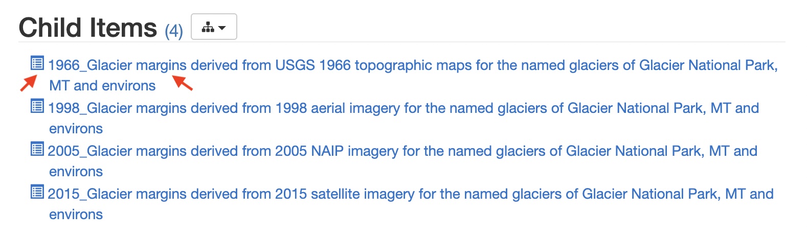
For this tutorial we will use GIS data from Glacier National Park in Northwestern Montana. The data can be downloaded from the USGS at this address.
If you have Google Earth Pro installed on your computer (it is free to download), you can view shapefiles overlayed on Earth. Consider downloading the data locally, and playing around with it in Google Earth:
Once downloaded, the data can be imported with:
file -> import
In Google Earth, the glacier data should look something like this:
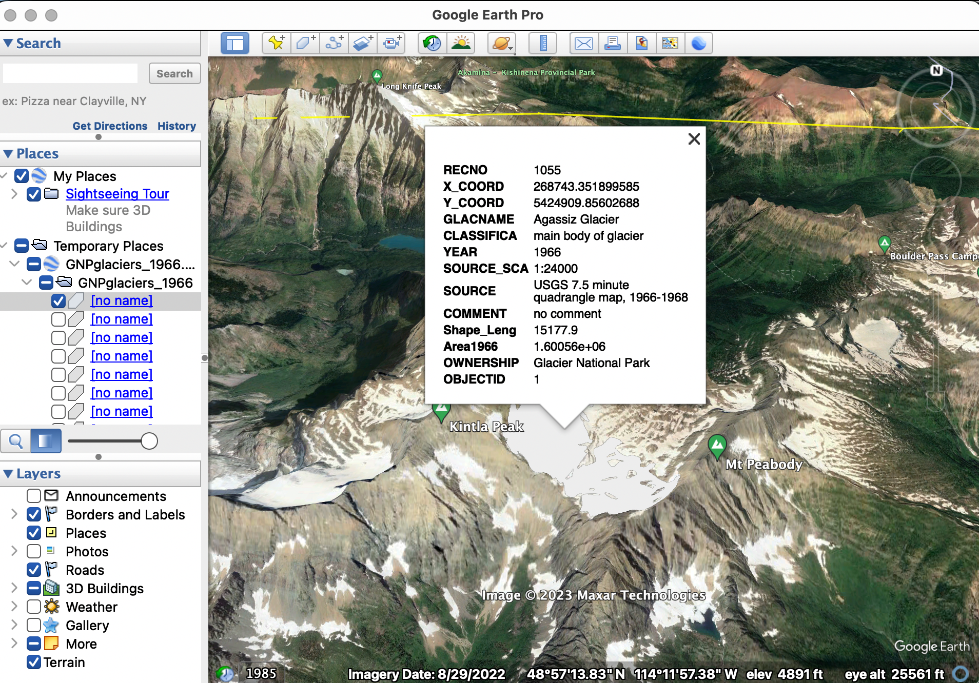
After (hopefully) gaining some familiarity with the data, let’s start actually working with the data in R. Open R Studio cloud, and create a new R script. Call it something like, Glacier-TDA. As before, we will use the RGDAL and SP libraries to upload and manipulate shapefiles:
library(rgdal)
library(sp)
Import the 1966 glacier data directly from the internet using download.file and then system to unzip the .zip file.
download.file("https://www.sciencebase.gov/catalog/file/get/58af7532e4b01ccd54f9f5d3?facet=GNPglaciers_1966",destfile = "/cloud/project/GNPglaciers_1966.zip")
system("unzip /cloud/project/GNPglaciers_1966.zip")
Then read in the downloaded .shp file using readOGR.
glaciers1966 <- readOGR(dsn="/cloud/project/GNPglaciers_1966.shp")
Try to view the first glacier you’ve uploaded using the dataframe indexing syntax.
See the Answer
glaciers1966[1,]
Notice that the data is pretty big! Each glacier individually (like the county data we saw earlier) is fairly involved. Plus, altogether we have uploaded every glacier in GNP, so there’s a lot going on. Use the head command to view the first 5 glaciers if you want to get more of a sense of the complexity of our data.
See the Answer
first_five <- head(glaciers1966, 5)
first_five
Notice that the fundamental glacier shape data is stored in polygon format, which is the same as the county GIS data we used before. Try plotting the first glacier in our dataset.
See the Answer
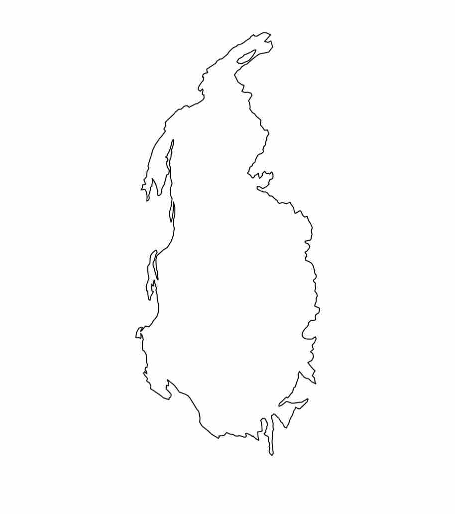
plot(glaciers1966[1,])
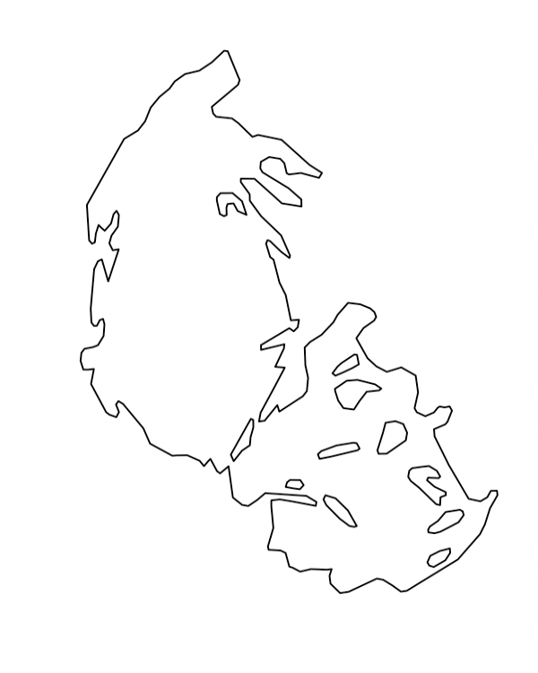
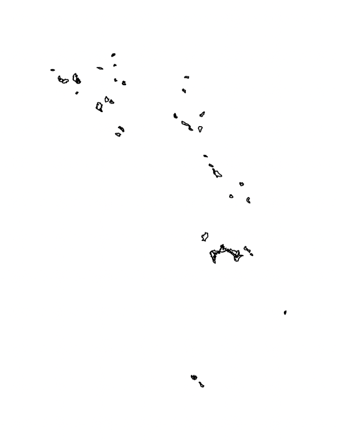
For fun, try viewing all of the glaciers in GNP in the same way.
See the Answer
plot(glaciers1966)
Transforming Raw GIS Data
For 5ish minutes, using what you know about filtrations, discuss amongst yourselves how we might transform our GIS data in order to study its topology. What options do we have? —
With the raw glacier data in hand, let’s try creating a grid of points lying within the polygon.
We’ll start out just with the first glacier in GNP on our list, and then move to a bigger set of glaciers. As a warmup exercise, see if you can find the name of glaciers1966[1,], the first glacier in our dataframe.
See the Answer
> names(glaciers1966)
 [1] "RECNO"      "X_COORD"    "Y_COORD"    "GLACNAME"   "CLASSIFICA"
 [6] "YEAR"       "SOURCE_SCA" "SOURCE"     "COMMENT"    "Shape_Leng"
[11] "Area1966"   "OWNERSHIP"  "OBJECTID"
> glaciers1966[1,]$GLACNAME
[1] "Agassiz Glacier"
Do you remember how to sample within a spatial polygon? Recall from yesterday, we sampled from within counties in Montana randomly. See if you can sample randomly 1000 points from the Agassiz Glacier, and save this in the randGlac variable.
See the Answer
randGlac <- spsample(glaciers1966[1,], n=1000,"random")
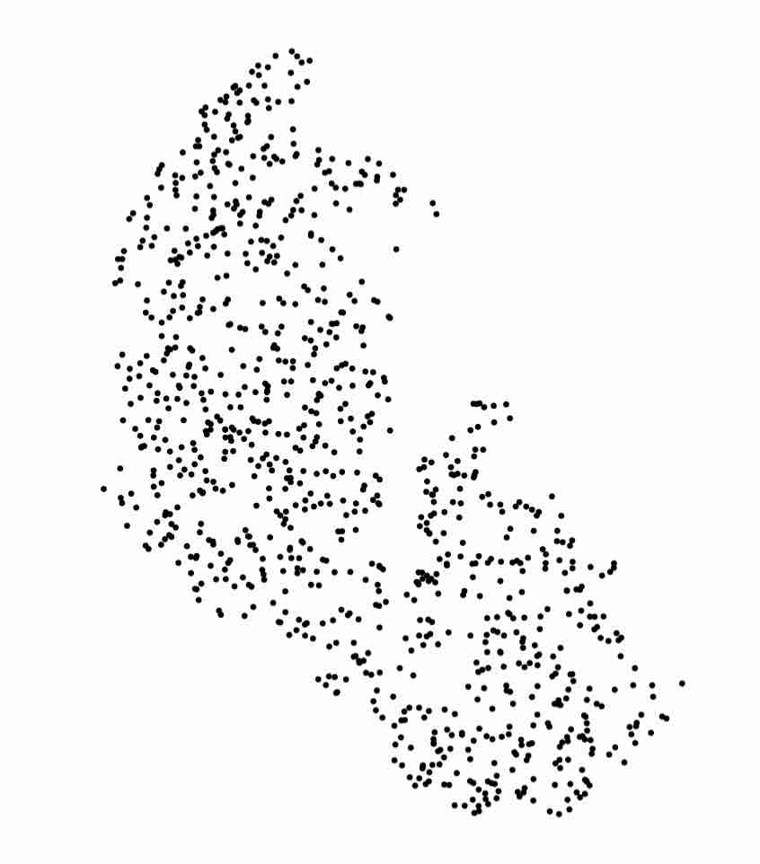
Now, let’s quickly visualize our random sample:
plot(randGlac)
Expected Output
As might have arisen in your discussions, we could take a random sample from the Agassiz glacier. However, this would introduce additional imprecision and randomness to our data, which we don’t necessarily want. A better idea is to get a uniform grid from within our polygon, and use TDA (namely, a grid filtration) on that.
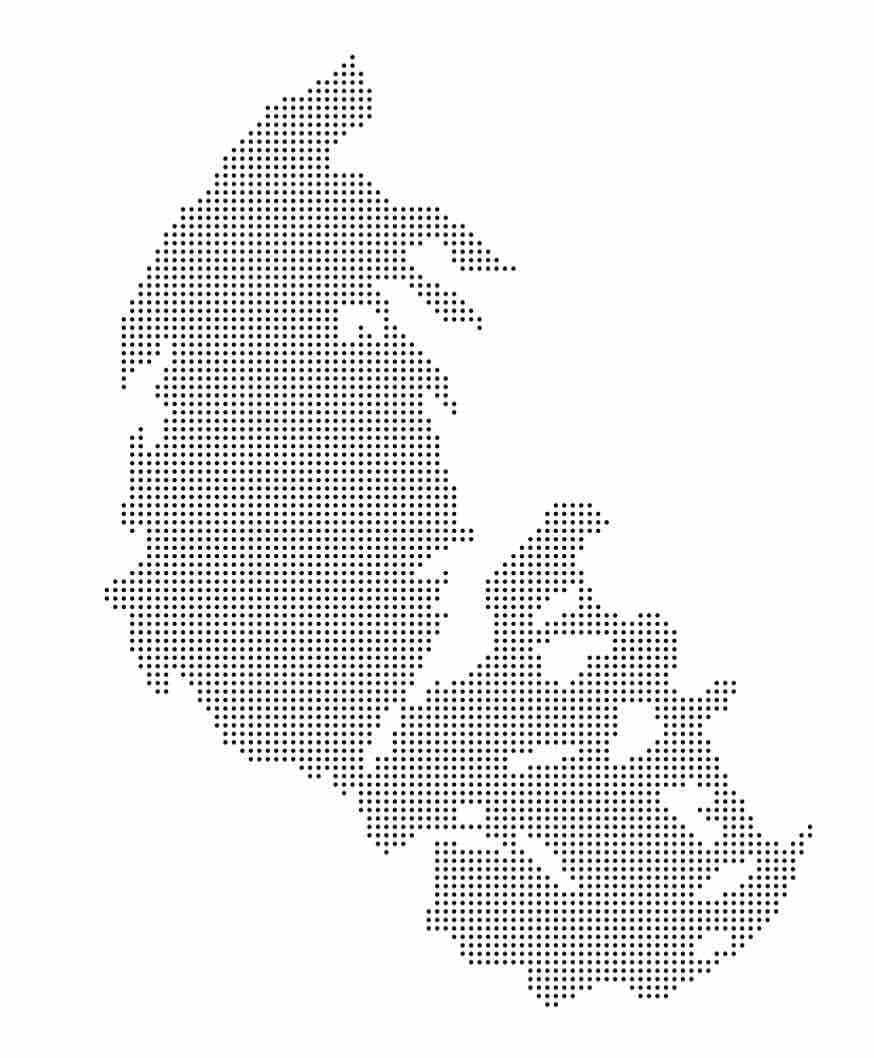
Let’s get a uniform grid of 4000 points from within our polygon. Luckily, the spsample function has the option to get a regular sample.
unifGlac <- spsample(glaciers1966[1,], n=4000, "regular")
Indeed, if we plot this we get a clean grid:
plot(unifGlac, pch=20, cex=.25)
Expected Output
And, we get something nice to do TDA with. That is, we can do a grid filtration! Recall that a grid filtration requires (1) a grid, and (2) a function on that grid. One simple way to assign a function to our grid is by computing the distance from each cell to the boundary.
To do this, we’re going to need to compute distance between sets of points. Given two sets $A, B \subset \mathbb{R}^2$, let $a \in A, b’ \in B$. For every $a \in A$, distFct computes the Euclidean distance $d(a, b’)$ where $b’$ is the nearest point to $a$ in $B$.
In our example, what are the sets $A$ and $B$? We take $A$ to be the grid stored in unifGlac, and $B$ to be the boundary of the polygon glaciers1966[1,].
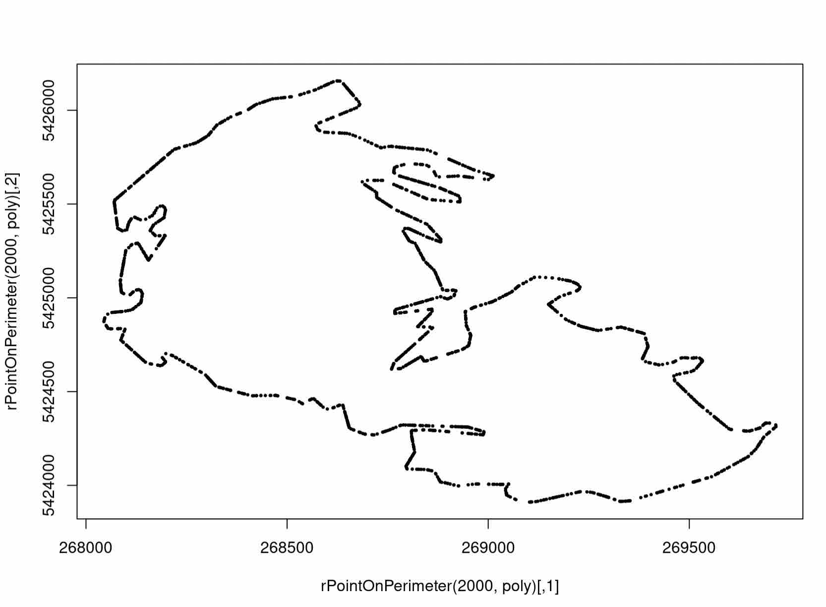
However, distFct requires two finite sets as input. To represent the glacier boundary as a finite set, we define a set of points living on the edge of the polygon in the following helper function.
rPointOnPerimeter <- function(n, poly) {
    xy <- poly@coords
    dxy <- diff(xy)
    # hypot depends on the pracma library, make sure it's installed
    h <- hypot(dxy[,1], dxy[,2])

    e <- sample(nrow(dxy), n,replace=TRUE, prob=h)

    u <- runif(n)
    p <- xy[e,] + u * dxy[e,]

    p
  }
This function has one dependency we haven’t installed yet, the pracma package. Make sure you install and import it before running the function.
install.packages("pracma")
library(pracma)
We can now define a set for the boundary by running this helper function on the polygon representing the Agassiz glacier.
poly <- glaciers1966[1,]@polygons[[1]]@Polygons[[1]]
perimeter <- rPointOnPerimeter(2000, poly)
Let’s see how the helper function worked for us by plotting the result.
plot(perimeter)
Expected Output
A Note on our Helper Function
Technically, this sampling is actually not precisely the right thing to use
for our data, but it is what we use in the interest of simplicity.

This is because (1) the sample is technically random and not scaled
for edge length, and (2) the sampling neglects holes within the polygon
(although distance from the outer boundary is also a justified function).

We leave it as an exercise to come up with a more representative set on the
boundary to use in the distance function.
Assigning a Function to a Grid
Now that we’re equipped with the required sets, we can use the distFct function in the R TDA package to compute distances from our grid to its boundary.
We do so as follows:
dfGlac <- as.data.frame(unifGlac)
distances <- distFct(perimeter, dfGlac)
More Info
Here, we need to cast the our grid as a dataframe.
This is an incredibly common procedure in R, as different applications use
different abstractions of matrices.
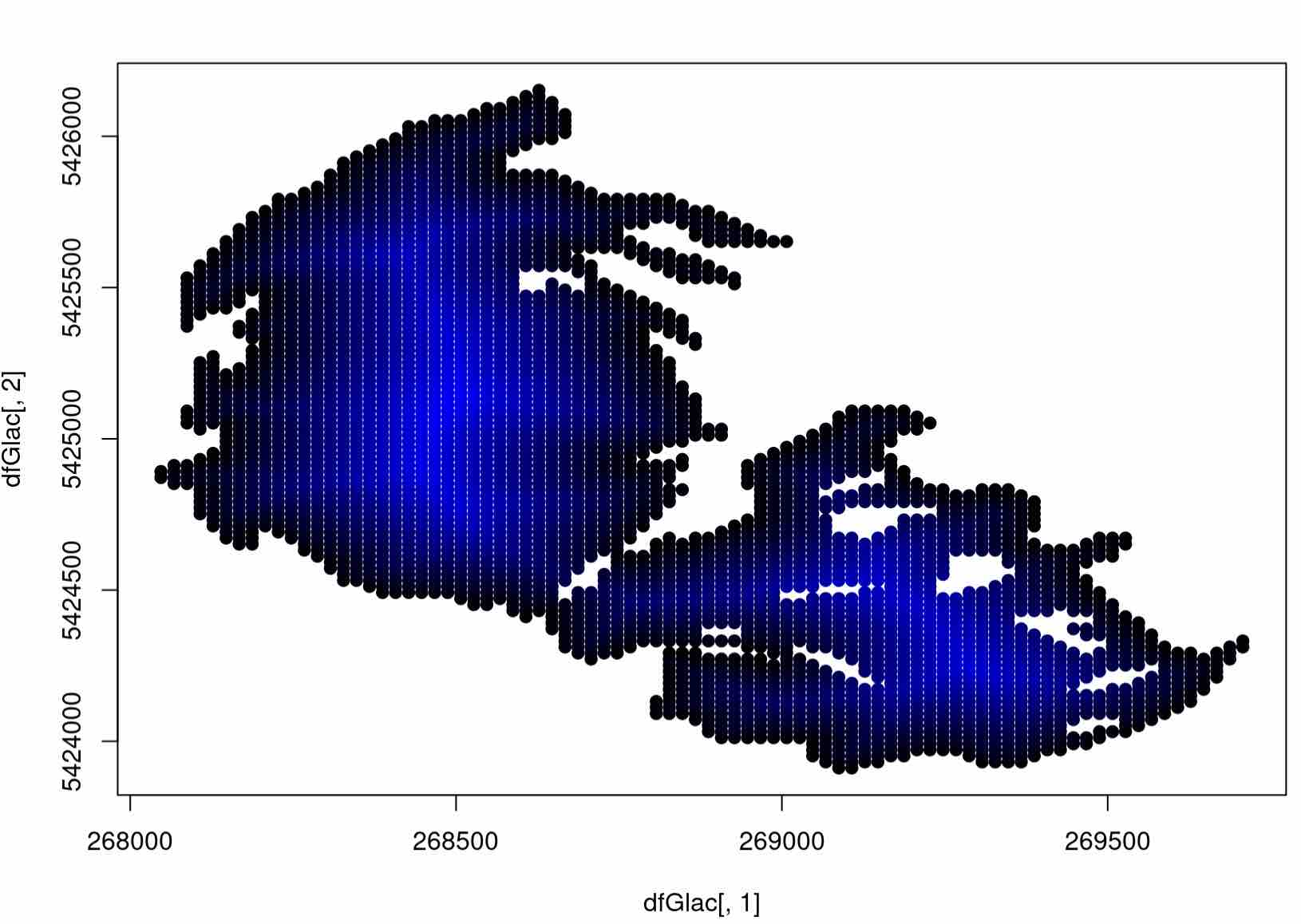
That was a decent amount of code flying around! Let’s visualize what we’ve done, adding in some color to our grid. To do so, we will push the plot function in R to its limit, interpolating in shades of blue to designate grid cells with the highest ditance to the boundary. Make sure you understand what the arguments mean here:
# normalize each distance in our function
colors <- distances/max(distances)
plot(dfGlac[,1], dfGlac[,2], pch=20, col= rgb(0, 0, colors), cex=1.5)
Expected Output
A Grid Filtration for Glacier Data
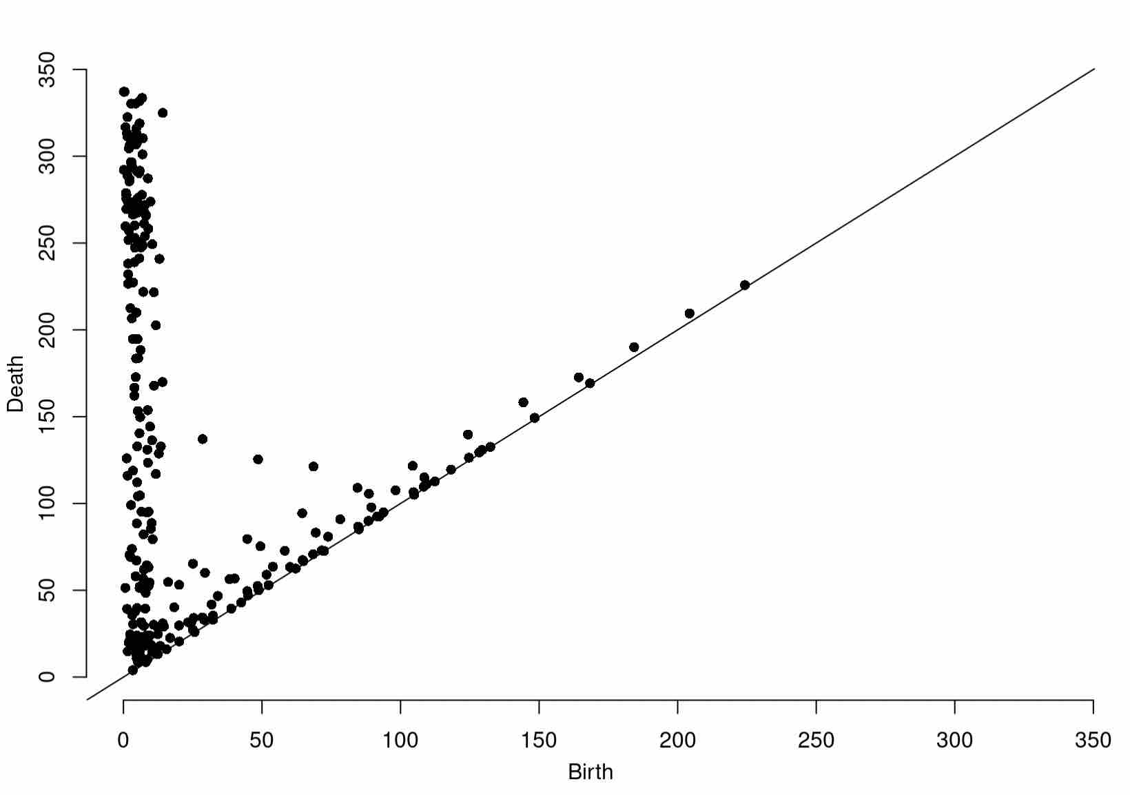
At last, we can compute a grid filtration on our data. Having seen grid filtrations before, as a challenge, see if you can compute the persistence diagram of the grid filtration resulting from thresholding the values stored in distances with respect to our grid (as a dataframe), dfGlac.
See the Answer
Diag1966 <- gridDiag(X=dfGlac, FUNvalues = distances, maxdimension = 1, sublevel = TRUE, printProgress = TRUE)
Of course, be sure to plot your findings:
plot(Diag1966[["diagram"]])
Expected Output
With this in hand, let’s take a look at the Agassiz glacier later in life. We will now download glacier data from 1998, 2005, and 2015.
# Download 1998 data
download.file("https://www.sciencebase.gov/catalog/file/get/58af765ce4b01ccd54f9f5e7?facet=GNPglaciers_1998",destfile = "/cloud/project/Glaciers1998.zip")
system("unzip /cloud/project/Glaciers1998.zip")


# Download 2005 data
download.file("https://www.sciencebase.gov/catalog/file/get/58af76bce4b01ccd54f9f5ea?facet=GNPglaciers_2005",destfile = "/cloud/project/Glaciers2005.zip")
system("unzip /cloud/project/Glaciers2005.zip")


# Download 2015 data
download.file("https://www.sciencebase.gov/catalog/file/get/58af7988e4b01ccd54f9f608?facet=GNPglaciers_2015",destfile = "/cloud/project/Glaciers2015.zip")
system("unzip /cloud/project/Glaciers2015.zip")
Then, import the data as you did before:
glaciers1998 <- readOGR(dsn="/cloud/project/GNPglaciers_1998.shp")
glaciers2005 <- readOGR(dsn="/cloud/project/GNPglaciers_2005.shp")
glaciers2015 <- readOGR(dsn="/cloud/project/GNPglaciers_2015.shp")
You now have all of the tools to carry out the bulk of the TDA pipeline on your own. As a challenge, try to compute a grid filtration starting from scratch for the Agassiz glacier in 1998, 2005, and 2015. (Be sure to plot along the way to build intuition!)
It may be easiest if you break up the tasks into steps, such as:
- Create a grid and points on the boundary
- Compute a distance function on each grid
- Compute a grid filtration on each grid
Solution to Step 1: Create Grid and Points on Boundary
unifGlac1998 <- spsample(glaciers1998[1,], n=4000, "regular")
unifGlac2005 <- spsample(glaciers2005[1,], n=4000, "regular")
unifGlac2015 <- spsample(glaciers2015[1,], n=4000, "regular")

perimeter1998 <- rPointOnPerimeter(2000, glaciers1998[1,]@polygons[[1]]@Polygons[[1]])
perimeter2005 <- rPointOnPerimeter(2000, glaciers2005[1,]@polygons[[1]]@Polygons[[1]])
perimeter2015 <- rPointOnPerimeter(2000, glaciers2015[1,]@polygons[[1]]@Polygons[[1]])
Solution to Step 2: Compute a Distance Function on Each Grid
distances1998 <- distFct(perimeter1998, as.data.frame(unifGlac1998))
distances2005 <- distFct(perimeter2005, as.data.frame(unifGlac2005))
distances2015 <- distFct(perimeter2015, as.data.frame(unifGlac2015))
Solution to Step 3: Compute a Grid Filtration
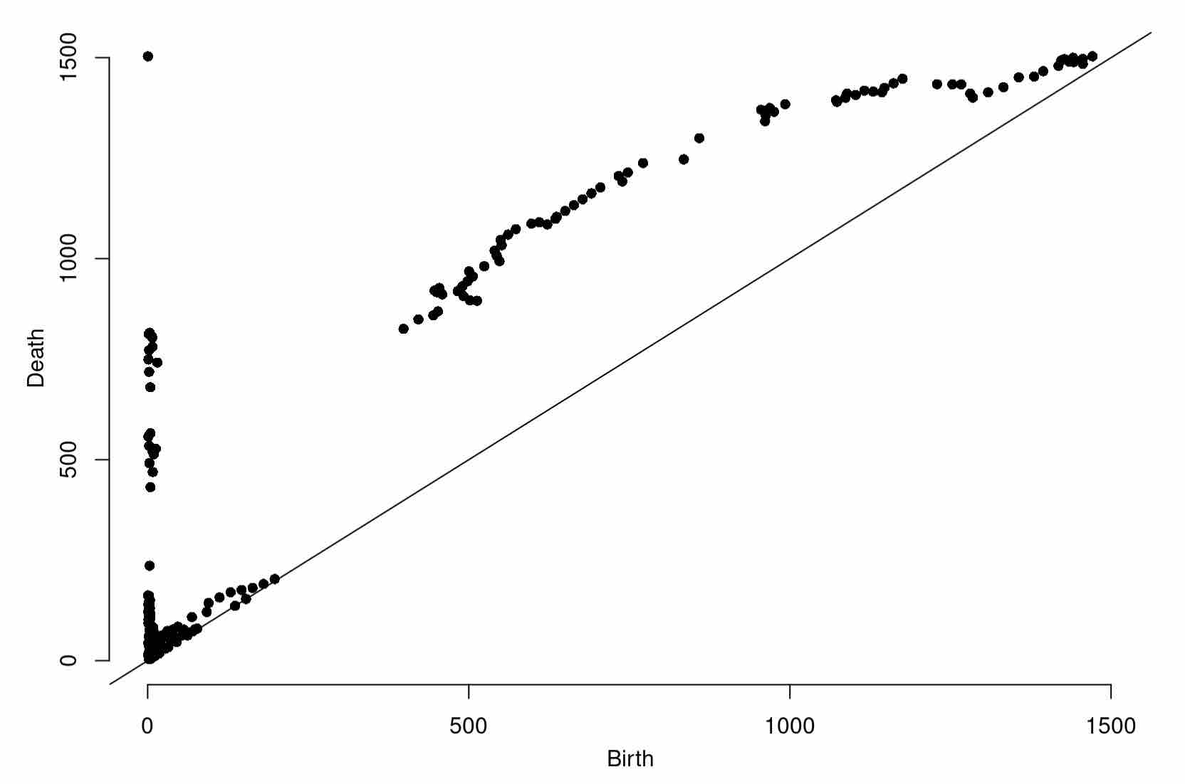
Diag1998 <- gridDiag(X=as.data.frame(unifGlac1998), FUNvalues = distances1998, maxdimension = 1, sublevel = TRUE, printProgress = TRUE)
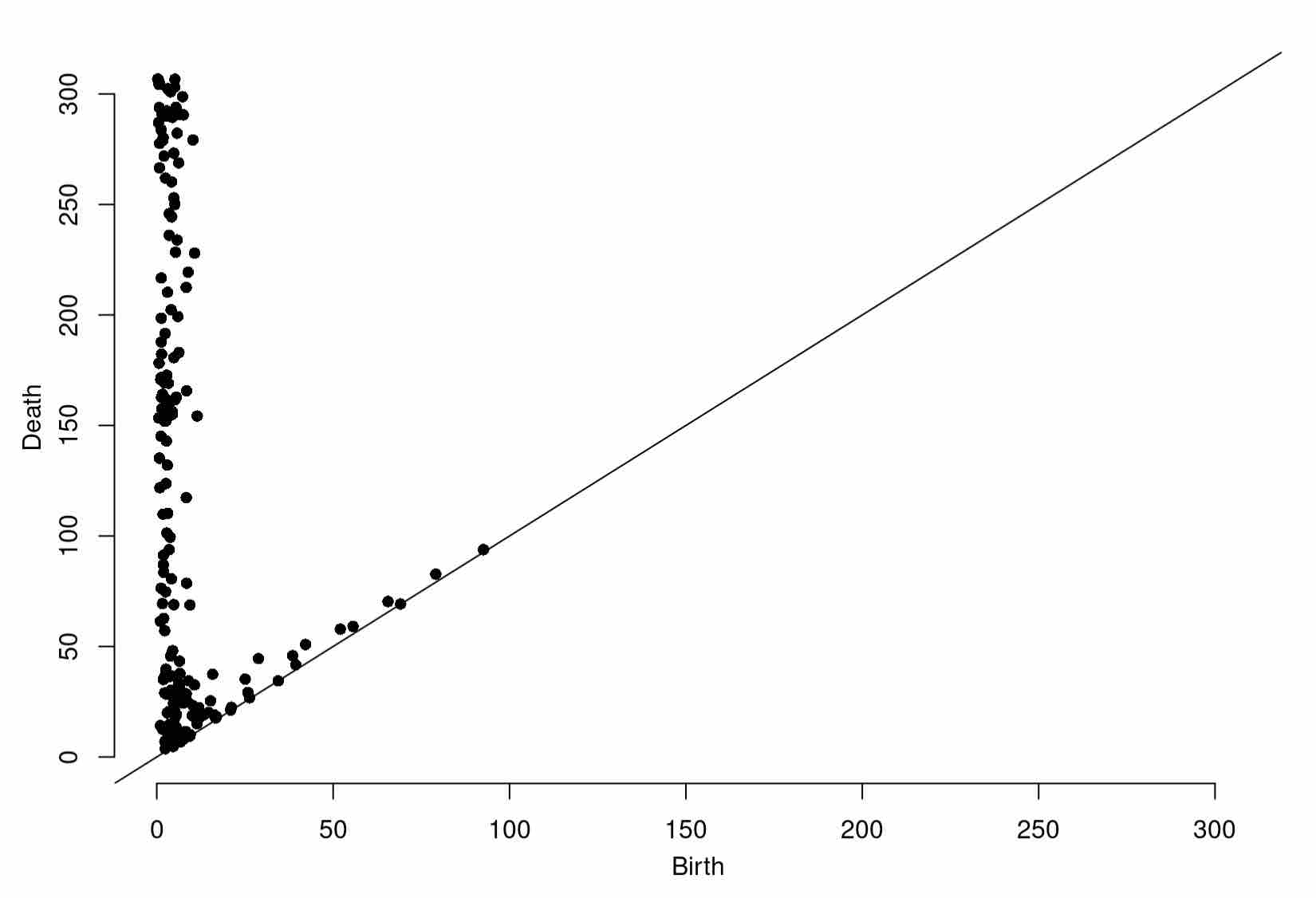
Diag2005 <- gridDiag(X=as.data.frame(unifGlac2005), FUNvalues = distances2005, maxdimension = 1, sublevel = TRUE, printProgress = TRUE)
Diag2015 <- gridDiag(X=as.data.frame(unifGlac2015), FUNvalues = distances2015, maxdimension = 1, sublevel = TRUE, printProgress = TRUE)
Once you’ve completed each grid filtration, plot the resulting persistence diagrams!
plot(Diag1998[["diagram"]])
Expected Output
plot(Diag2005[["diagram"]])
Expected Output
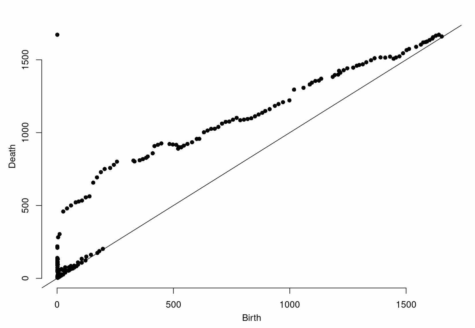
plot(Diag2015[["diagram"]])
Expected Output
You should see some noticeable changes in shape. We can quantify these more rigorously using the bottleneck distance, from Session 4.
Changes in the Agassiz Glacier Over Time
Recall the definition of the bottleneck distance, the cost of the optimal matching between points of the two diagrams. This provides a succinct summary of the change in shape of the Agassiz Glacier over time.
d1 <- bottleneck(Diag1 = Diag1966$diagram, Diag2 = Diag1998$diagram, dimension = 0)
d2 <- bottleneck(Diag1 = Diag1998$diagram, Diag2 = Diag2005$diagram, dimension = 0)
d3 <- bottleneck(Diag1 = Diag2005$diagram, Diag2 = Diag2015$diagram, dimension = 0)
These bottleneck distances are informative, but of course are not scaled to the corresponding intervals of time. Scaling them more faithfully illustrates the rate at which the shape of the Agassiz Glacier is changing. Try plotting the scaled distances with respect to their time intervals.
See the Answer
plot(x=c(1,2,3), y=c(d1/(1998-1966), d2/(2005-1998), d3/(2015-2005)), ylab="Bottleneck Distance", xlab="Measurement Interval", main="Change in Bottleneck Distance over Time")
# with this plot, we can even add segments for visualization
segments(x0 = 1, y0 = d1/(1998-1966), x1 = 2, y1 = d2/(2005-1998), col = "black")
segments(x0 = 2, y0 = d2/(2005-1998), x1 = 3,  y1 = d3/(2015-2005), col = "black")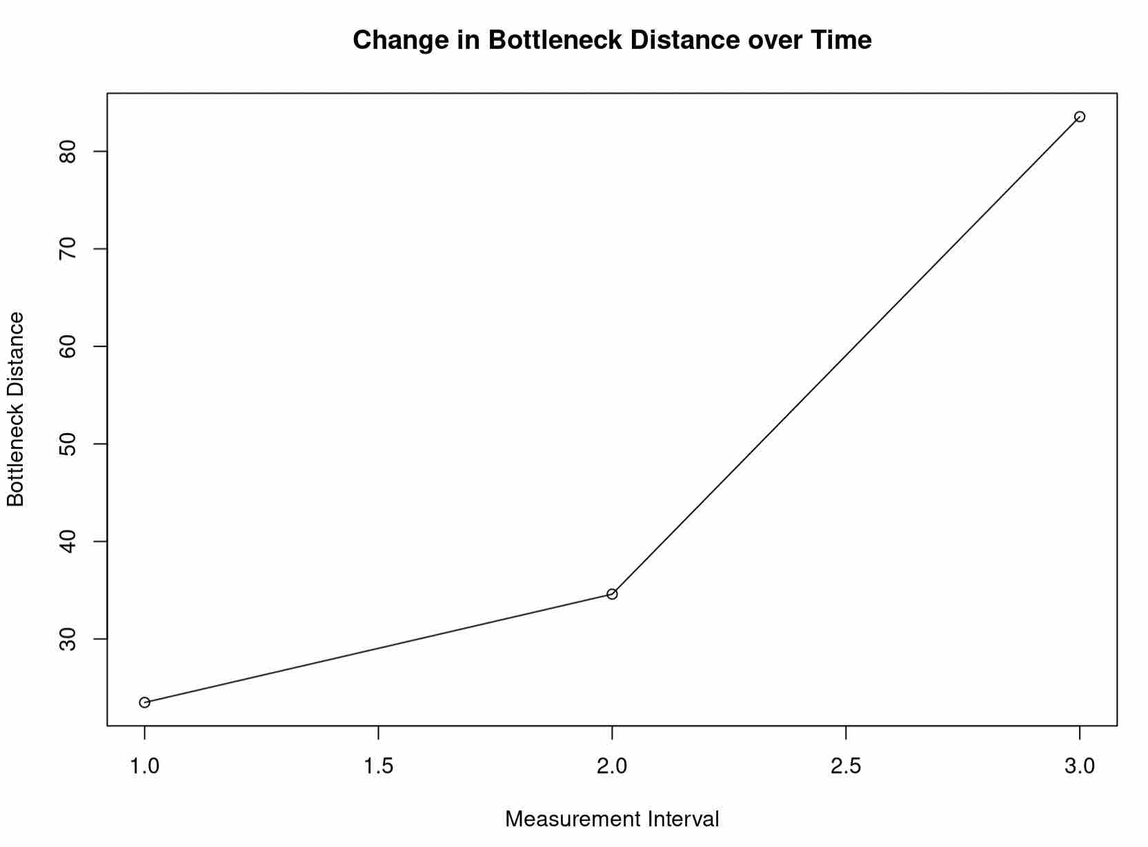
This is consistent to what our intuition might tell us about the changing shape of glaciers. Moreover, it is consistent with the data presented by the USGS, which shows the fastest area reduction of the Agassiz Glacier occuring most recently. Indeed, hopefully you had the chance to plot the Agassiz Glacier at each timestamp:
Agassiz Glacier in 1966
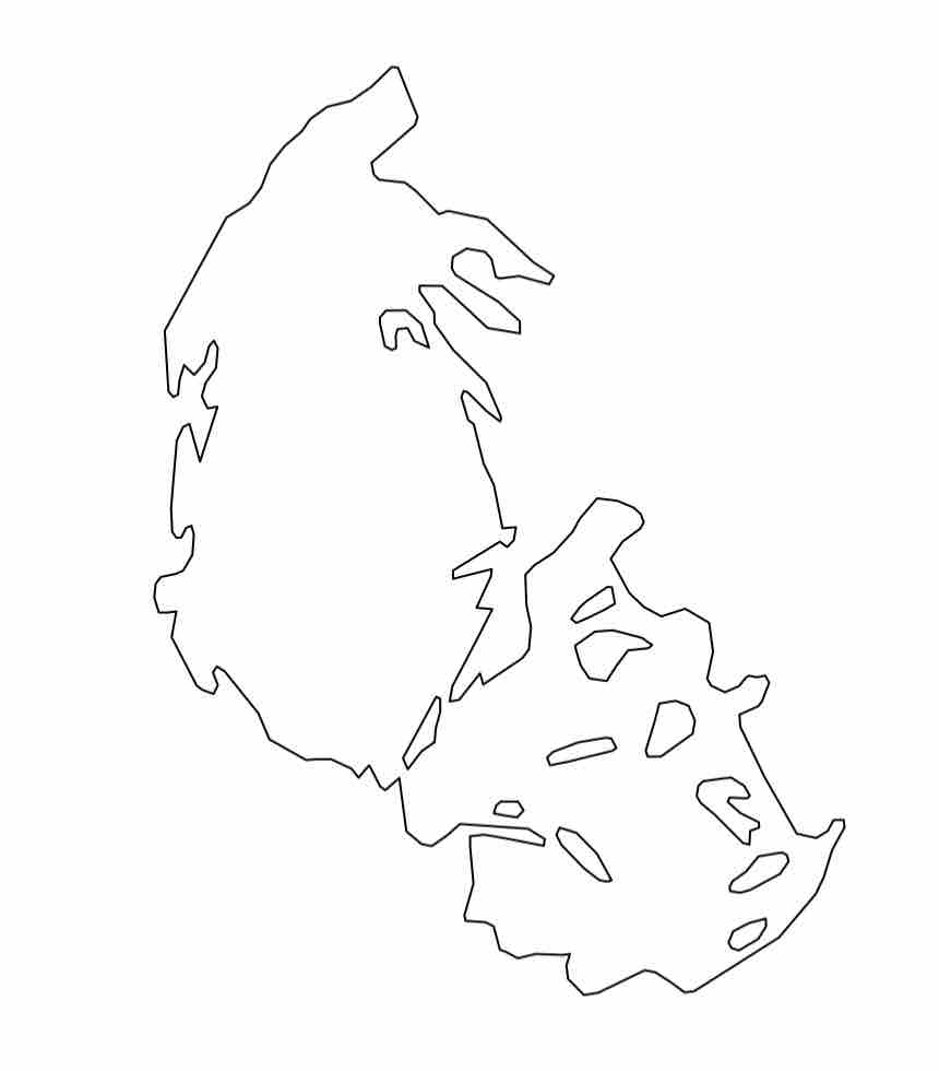
Agassiz Glacier in 1998
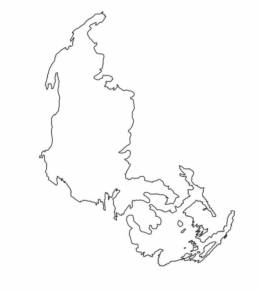
Agassiz Glacier in 2005
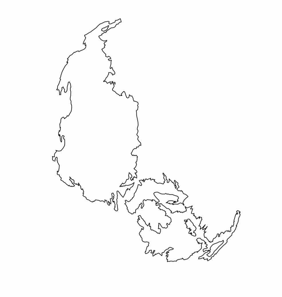
Agassiz Glacier in 2015
However, examining the Agassiz Glacier alone is of course much too small of a sample to tell us the full story. You will now investigate the changing shape of other glaciers in Glacier National Park.
A Final Activity
In the remaining time in this workshop, using what you know about R, data analysis, and TDA, see if you can replicate or contradict the findings in the USGS area reduction study also linked above. Create a new R Script, which you will submit to us with the concluding survey. Be sure to consider cases in which this study’s findings may be consistent with changing topological shape, and also consider inconsistencies (if you can find any), where perhaps shape may correlate less with area reduction in glaciers.
Wrapping Up
And that’s a wrap on the T4DS Workshop! It was such a joy to have you join us! In this final session, we hope that you have taken away:
- A topological frame of thinking when approaching data
- A fun application of what you learned about data wrangling in R
- An idea of the full topological data analysis pipeline, from raw data to topological shape comparison
- The ability to use TDA (mostly) independently
- To juxtapose topological methods with standard domain-specific techniques.
Credits
The teaser image for this session is again from the National Park Services. We end out the workshop with a classic view in Glacier National Park, of St. Mary Lake.
The rpointonperimeter function was taken from a helpful stack overflow post and adopted for our application.